Neon signs, rain, and towering buildings can signal “cyberpunk” in a single image. They are memorable, but they do not explain a world by themselves. The more interesting question is what those surfaces reveal about a city: who owns its space, what has been repaired instead of replaced, and how an ordinary person finds a place to live there.
Where the familiar image came from
Blade Runner presents a city shaped by shadows, rain, advertising, and a mixture of old and new design. Its visual roots include film noir and the work of a large production team. The film became an important visual predecessor of cyberpunk, but every future city need not look like it.
That matters when we use the word aesthetic. A glowing color palette is an easy way to recognize a work, but it is only one layer of its design. An advertisement above a crowded street can tell us who commands attention. A decaying wall beside a new network terminal can show where investment stops. These are interpretations of visual details, not universal rules for the genre.
Old and new occupy the same room
Cyberpunk settings often gain texture from technologies of different ages living together. The newest system may run on a patched building, a reused screen, or a service that people cannot afford to leave. The contrast creates a question: if the future is so advanced, why is ordinary life still precarious?
A perfectly clean control room can communicate one answer: the institution has resources and wants its work to appear orderly. A cramped workspace may communicate another: the person operating a powerful system has little control over the conditions around it. Both can belong to the same fictional city. Neither needs a wall of neon to make sense.
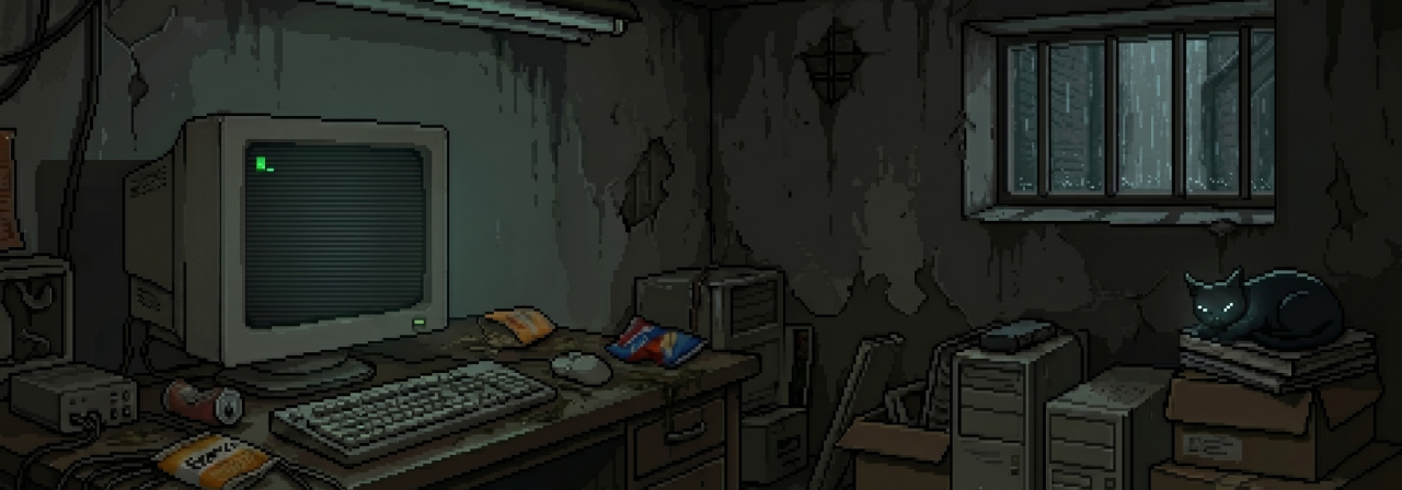
Our Ghost Terminal room artwork uses a small desk, an old CRT, cables, worn walls, and a window to locate its operator. It is room artwork, not a gameplay screenshot. We use these details to suggest a working place inside a larger city; the image does not tell the entire story of that city.
Follow the signs of power
Imagine two versions of the same street. In the first, every screen carries the same company's message and all doors accept its identity service. In the second, residents have covered some of those screens with local notices and built routes around a locked entrance. The buildings have not changed much. The story has: the second version shows how people respond to the system.
This is where visual design can carry a social idea. A corporate logo may establish ownership, but a handwritten repair notice can show dependence and improvisation. A surveillance camera may show that someone can watch; a blind corner may show how people preserve privacy. The point is not to fill every image with symbols. A few consistent details can let the reader infer what life is like between major events.
A city can be cyberpunk without the standard palette
Japanese cyberpunk works also have very different surfaces, from Akira's expansive city to the harsh, close-up bodily change of Tetsuo: The Iron Man. One look cannot stand in for all of them. A bright daytime setting, a plain office, or an unadorned machine can still raise cyberpunk questions about bodies, networks, and control.
Ask three things when looking at a scene: who made this place, who maintains it, and who is allowed to change it? The colors may draw you in. The answers turn the image into a world.